Selecting colors of beads for a bead project is my first step towards the completion of the beautiful piece. It is fun and exciting process, but I wasn’t always that great about color. As an artist who was very comfortable with black and white drawings, but always wanted to paint, most of the time I feared choosing a palette for my paintings. I always felt I am not good at it. However, it is my tendency to put more effort into projects that don’t work when I need them to. Analyzing my journey towards better colors in my life I came up with following strategies for people who would like to improve their understanding of color and use it better.
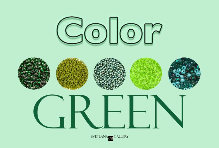
Understanding Color
First step towards better color understanding is to visit as many art events as possible and look through as many art books as you can lay your hands on.
- Museums, exhibitions, galleries
- Art books
- Internet galleries, internet access to art museum collections
Study Color Guides
Second step is to surround you with color guides and to study a color wheel.
Check out great color guide books. Here is a list of books I read.
Color: A Natural History of the Palette
Color Index
Learn how to use a color wheel watching this video.
Play with Color
Third step is to experiment with any media that lets you put colors together. Feel like you are not ready to paint? I am not talking about painting yet.
- Play with mosaic. If you are to pick a mosaic game online, make sure it has many color variations.
- Study home improvement store interior decor section and play with paint color samples
- There is an app for everything. Use apps.
I have several apps installed on my phone. Color Harmony by Powsty is one of the friendliest of them. It only took a minute to understand it. I immediately saved several color palettes to use while I am shopping for beads. I also think, it will come handy when I shop for any particular fashion accessory. It might help matching colors and making sure they will correspond with colors I already have in my wardrobe.
- Coloring books are very helpful, too.
- Color Software – another very useful tool when working or playing with color.
Exercise!
Forth step is to extract colors from any art piece you like and analyze it, Here is how to do that:

- Pick up a piece that you like. For beginners, I suggest to pick up a graphic piece that you like (advertisement, textile piece, business logo) -it will be easier to distinguish between colors, also the number of colors is usually limited to several. Notice how many and what colors are used in this piece.
- Using colored pencils or markers, make color swatches of these colors on a separate piece of paper.
- Notice how much of space each color takes in the art piece.
- Which color you like most?
- Which color you would exclude?
- Cut out your swatches and experiment by rearranging.
- Create your own design using these colors: try scrapbooking or drawing app, but the best way, in my opinion, is to experiment with real paints, markers or colored pencils (the cleaner way).
Since I work primarily with beads now, selecting colors of beads has become easier using this method. Decide on colors first, have your swatches ready, and then pick beads.
No compromises!
Fifth step is to avoid compromises
Choosing colors is a delicate and sometime difficult process. Very often compromises you make along the way might ruin your art. Here are some compromises you might be tempted to make and reasons to avoid them:
- Don’t replace an ideal color with a close one you have purchased before. People may want to care for a poor artist, but not for poor art.
- Don’t choose colors just because you like them. Choose them because you found the way to share your love!
- Two colors may look effective, but often they rather look flat. Be courageous, add a third color!
- Too many colors may entertain some people, but most of them would feel afraid for their life. Chaos never made anyone feel safe.
Stay tuned!
Next post on color will be about choosing color palette for a bead embroidery project with a focal point.